The J is the Jewish Community Center located in Scottsdale, Arizona. The facility welcomes people of all faiths and provides many member services including a country-club style gym and aquatics center, a preschool, a cafe, kids camps, community programs, and special events.

My redesign of The J website was launched in September 2015 and won a gold Hermes award in April 2017.
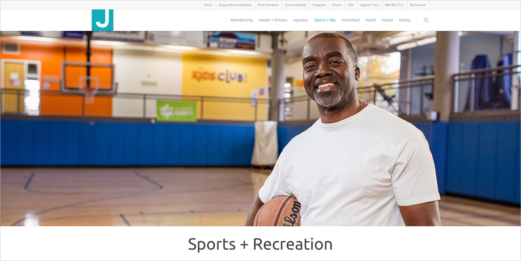
In March 2015, I spearheaded the redesign project. The most recent version of the site had been launched in 2009, and it suffered from a range of issues. Some were fundamental design problems, some were implementation problems, and all were exacerbated by the fact that several employees and contractors with varying degrees of experience had maintained the site throughout the years. The site was neither mobile-friendly nor SEO-friendly, with an unintuitive menu structure and disorganized page layouts without clear calls-to-action. Visually, the site featured a mix of poor-quality photography and random graphic design styles. An antiquated platform made publishing and maintenance unnecessarily difficult.

PLANNING

I began this project by working with the Chief Marketing Officer to create a document detailing the status of the existing site, the state of current website design and development, and the benefits of committing to a total site redesign built upon a modern, well-supported platform. Upon approval from the CEO, I then conducted interviews with employees throughout the organization and gathered their thoughts on the positives and negatives of the existing site and their suggestions for improvement.

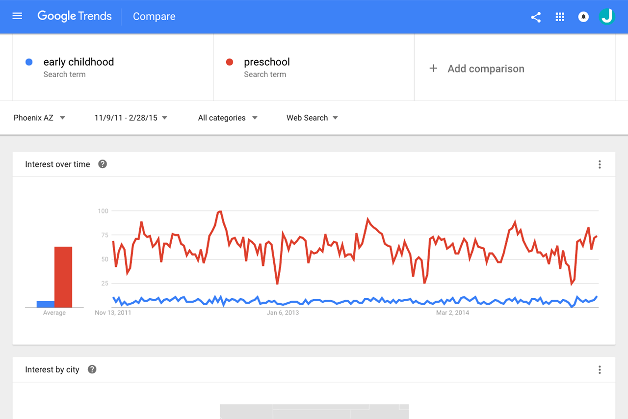
Google Analytics had been tracking the site since 2011, which provided us with four years of data to analyze. We also used Google Trends to compare keyword usage and discovered some interesting and helpful information. For instance, although The J refers to their preschool as an “early childhood center”, people much more often search for “preschool”. All of this was taken into account during the production phase of the new site, from copywriting to defining image and page naming conventions.

WHITEBOARD SESSIONS

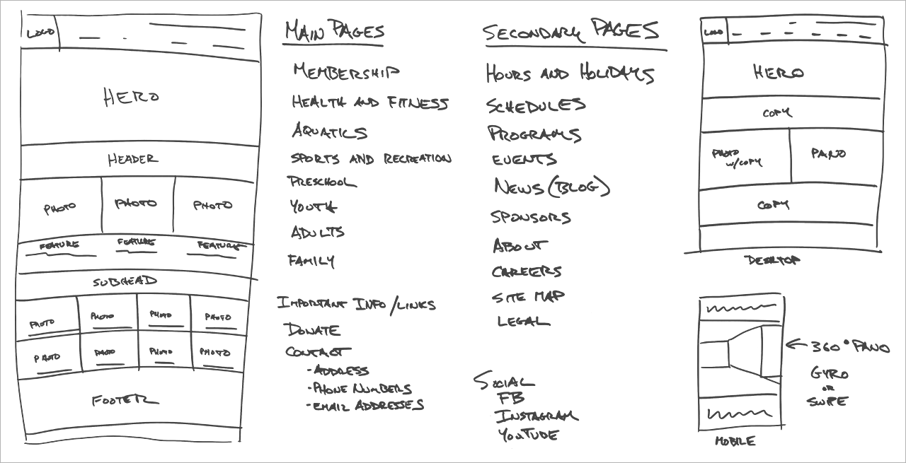
Our design and production team consisted of me and a copywriter. Together we compiled our information and organized our preliminary ideas on a whiteboard. Thanks to the time and effort we put into the previous development phases, our whiteboard sessions produced work that was readily transferred to wireframing.

WIREFRAMES

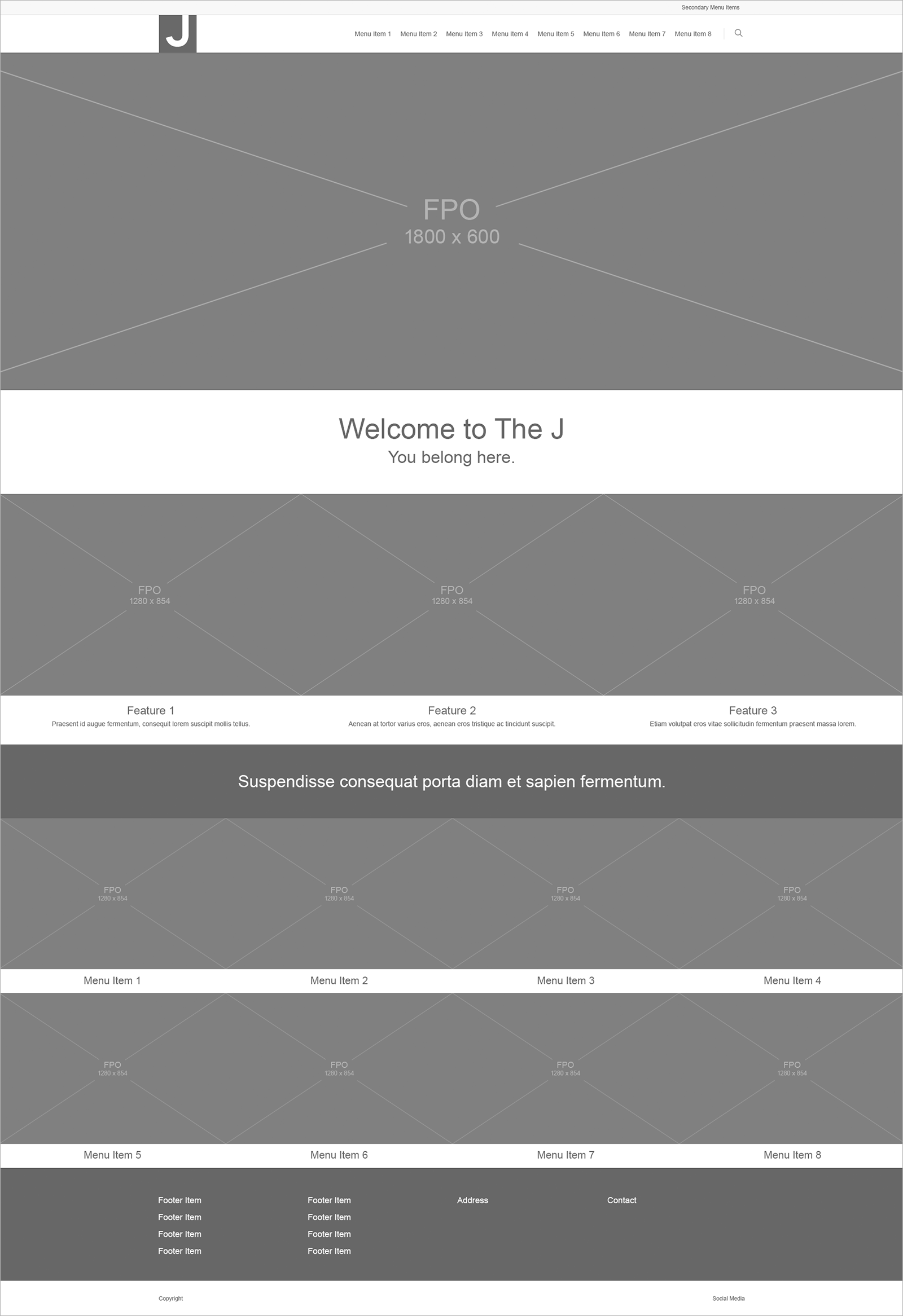
During our planning stages, we chose to build the site using WordPress. The wireframing stage in WordPress went very smoothly and quickly, with FPO images and copy providing easily-editable elements to manipulate as we worked toward final page layouts and an overall site map structure.

WEBSITE

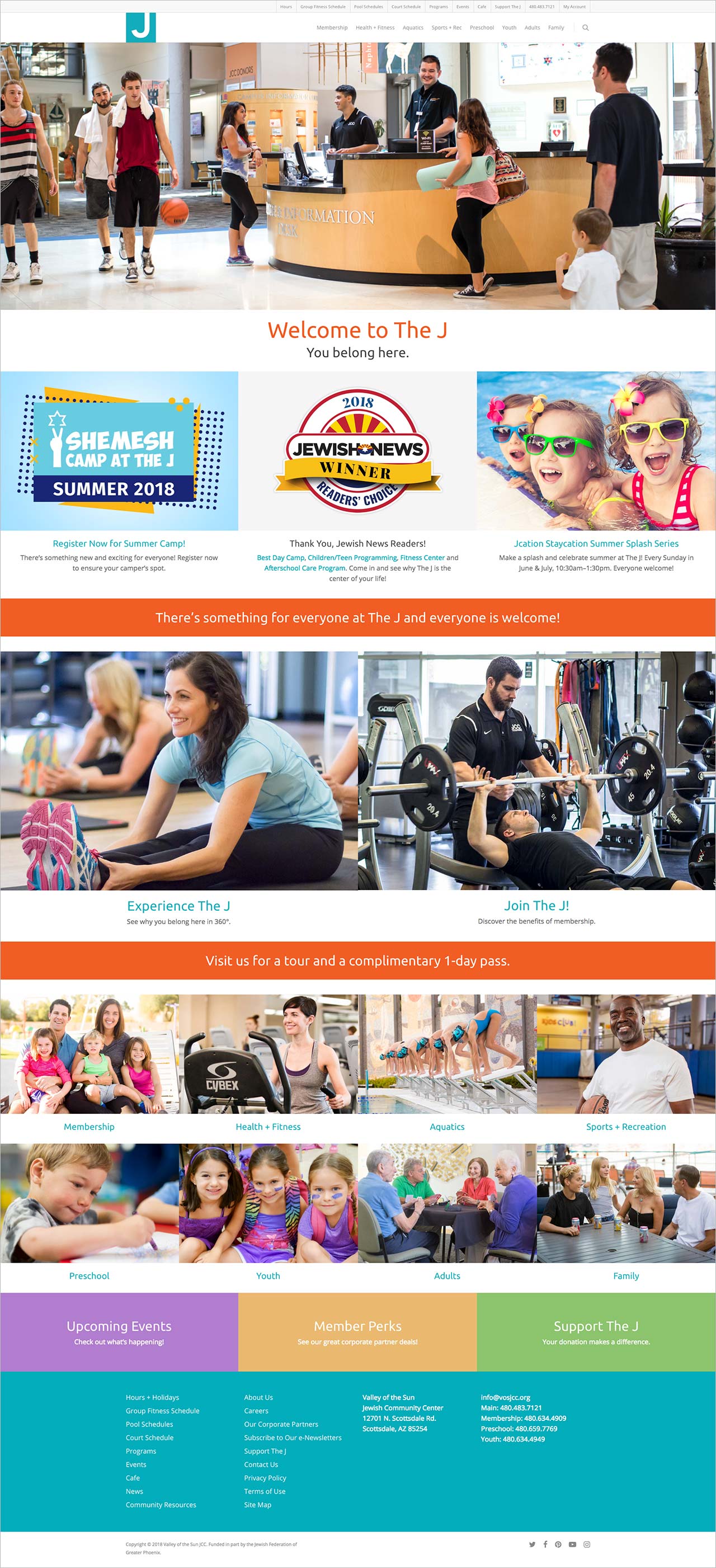
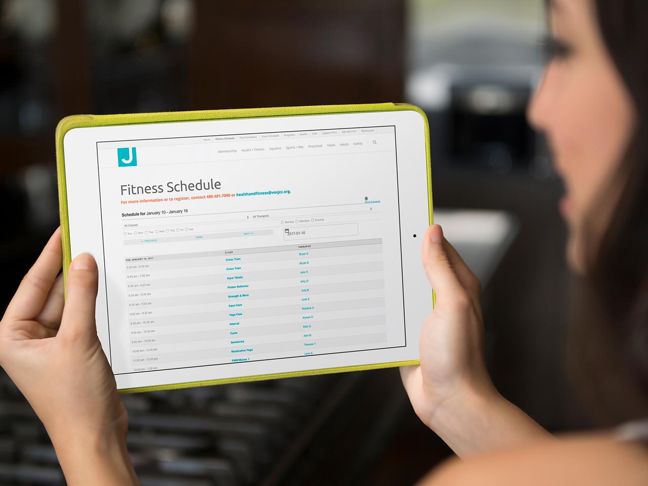
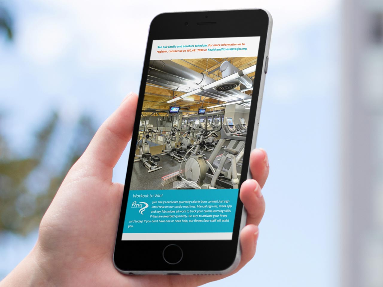
The new J website went live in September 2015, taking six months to complete alongside other projects. The launch and maintenance of the site have been a huge success, with the national JCC association recognizing it as one of the best-designed sites in their network. Sessions and users have both increased approximately 15% over the previous year thanks in part to the useful features and functionality that WordPress and its development community provide, such as plug-in integration with the J’s MindBody group fitness schedule. Other features like 360-degree panoramic views allow potential members to virtually experience the facility before joining.