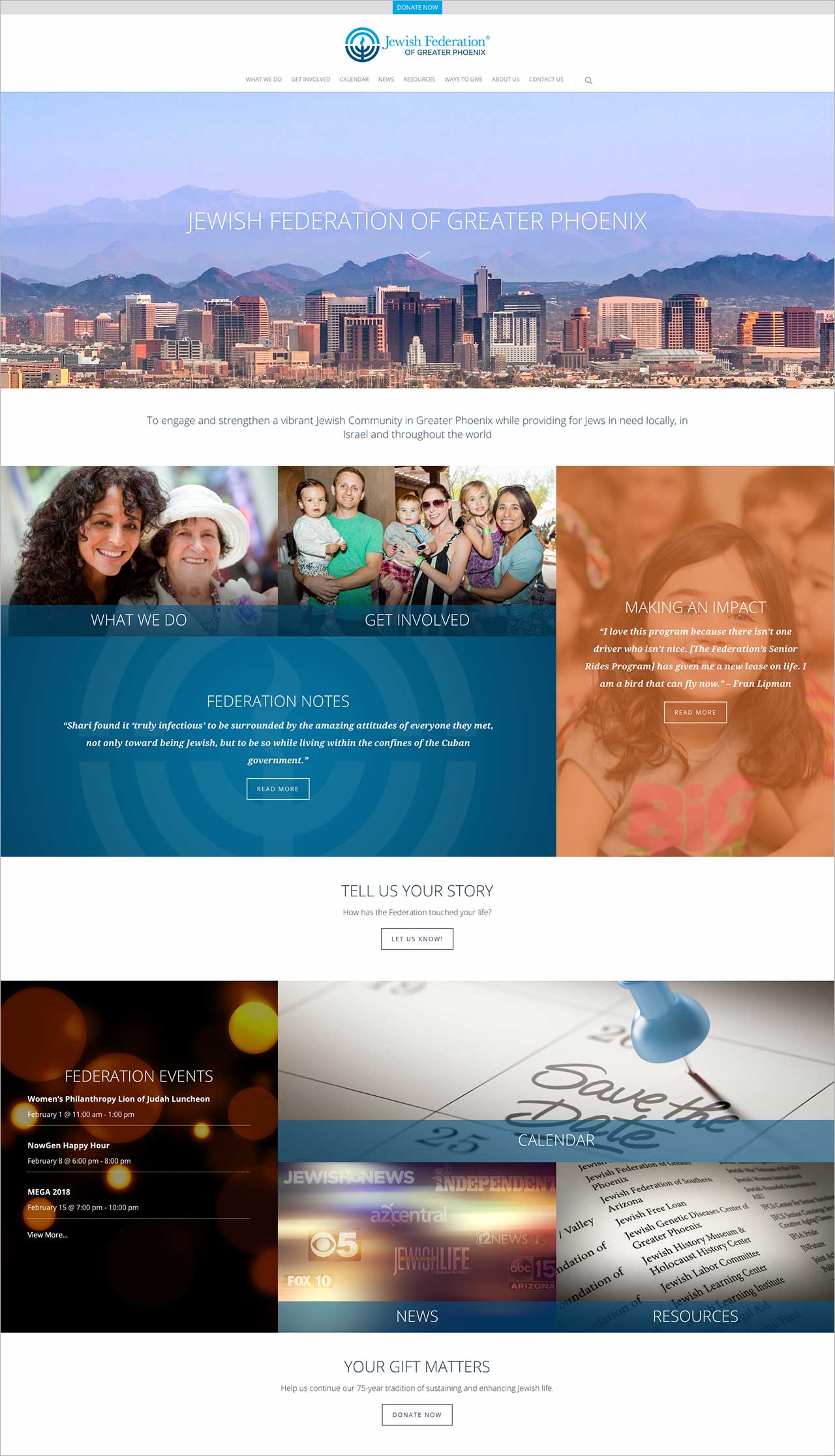
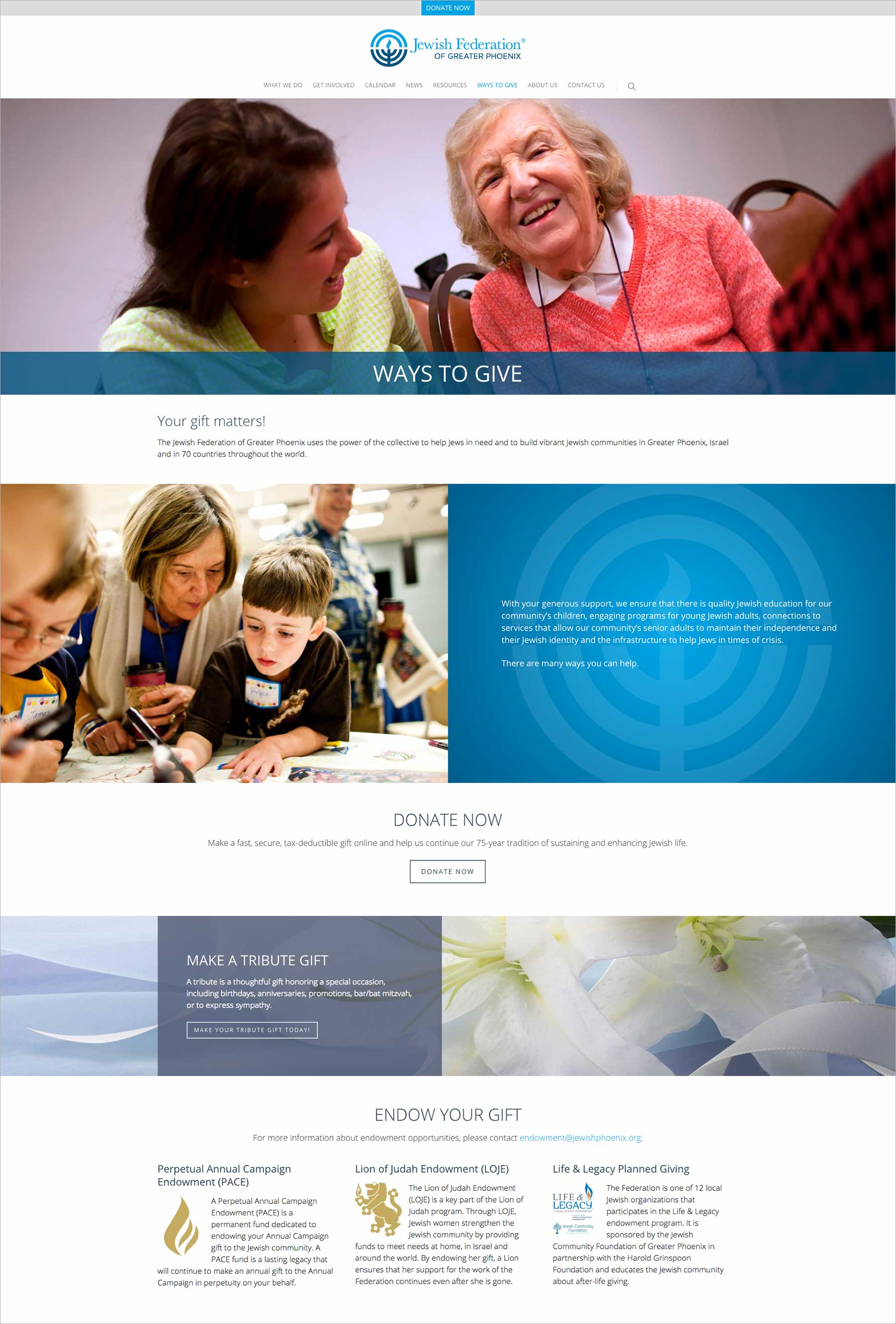
The Jewish Federation of Greater Phoenix is a non-profit organization that strengthens and sustains Jewish life and identity while meeting critical needs in Greater Phoenix, Israel, and around the world.

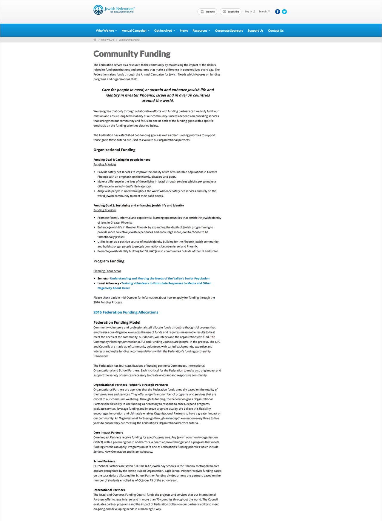
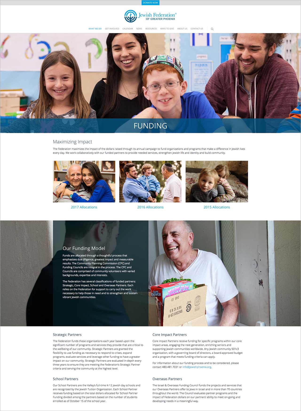
My redesign of the Federation website was launched in February 2018. The website won a platinum AVA award in January 2019 and a gold Hermes award in April 2018.

Visit the site.

The Federation had previously launched a redesigned website on a proprietary platform in September 2014. Although the platform provided a reasonable amount of features and functionality, design and customization options were limited and the experience of using the site felt dated.

The site also suffered from critical content-related issues. Over the years, several people had contributed copy to the site, resulting in a disjointed message lacking a cohesive voice. Content was generally disorganized, repetitious, and in some cases outdated.

A redesign would provide an opportunity to produce an organized, modern, and compelling website with a consistent tone and clear calls to action.

PLANNING

I spearheaded the redesign of the site in September 2016. At the outset, we considered the types of people who visited the Federation site, their motivations for doing so, and how we could fulfill their needs and compel them to donate and get involved. We also looked at the two year’s worth of analytics data captured since the previous site launch.

SITE STRUCTURE AND PAGE LAYOUTS

Using the existing website as reference and keeping in mind the content issues stated previously, I mapped out a new site structure. Menu items were reorganized into more logical and expected locations. Page flow now made more sense, and visitors would be able to much more easily find the content they need.

As I began to create page layout concepts, I considered how the existing site featured very few images. Given that the Federation is all about helping people, I ensured that images would help tell the Federation’s story and create a call to action. Images would also serve to break up the pages into rows of easily readable sections. By combining FPO images and greeked blocks of copy with specific word counts, I was able to fine-tune each page layout and provide our copywriter with helpful word count targets.

PREVIOUS FUNDING PAGE

REDESIGNED FUNDING PAGE

The existing homepage had considerable design issues that needed to be addressed. For one, the design prioritized upcoming Federation events over other content that should be given greater visibility, for instance stories about how Federation funding has made an impact on people’s lives. Also, when there were few or no upcoming events, the page essentially collapsed. To solve this problem, I created an evergreen design that better prioritizes information and doesn’t structurally rely on temporary content.

PREVIOUS HOMEPAGE

REDESIGNED HOMEPAGE

WEBSITE

Today, the Federation website is a much-improved experience that properly reflects the organization’s mission and values in a singular, compelling voice. Moreover, as a budget-conscious non-profit, WordPress now allows the Federation to maintain a modern, extensible website at a fraction of the cost of their previous platform.